


Data and Line Graphs
| Exercise | Problem | Answer |
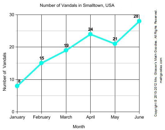
| 1 | In which month were there the most vandals? | June |
| 2 | In which month were there the least vandals? | January |
| 3 | How many vandals were there in March? | 19 |
| 4 | In which month were there 24 vandals? | April |
| 5 | How many vandals were there in February? | 15 |
Constructing Line Graphs
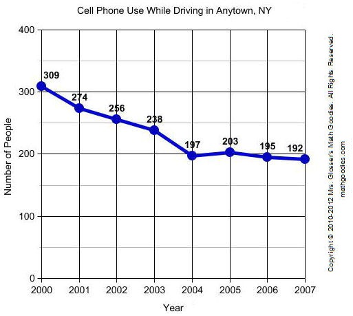
| Exercise 1: | In 2000, a law was passed against the use of cell phones while driving in Anytown, N.Y. The number of people who use cell phones while driving in Anytown has changed each year since then as shown in the table below. Construct a line graph to visually display this data. | ||||||||||||||||||||
|
|||||||||||||||||||||
| Solution: | Answers will vary depending on the scales used. A sample line graph is shown below. | ||||||||||||||||||||
 |
|||||||||||||||||||||
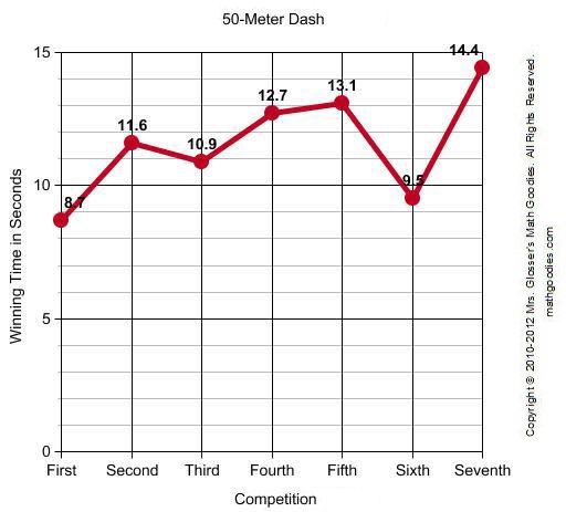
| Exercise 2: | There were a total of 7 competitions for the 50-Meter Dash at a school. Winning times were recorded in seconds as shown in the table below. Construct a line graph to visually display this data. | ||||||||||||||||||
|
|||||||||||||||||||
| Solution: | Answers will vary depending on the scales used. A sample line graph is shown below. | ||||||||||||||||||
 |
|||||||||||||||||||
Data and Bar Graphs
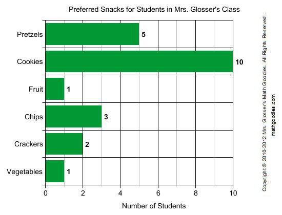
Students in Mrs. Glosser's class were surveyed about snacks and asked to choose the one snack food they liked most from a list. The bar graph below summarizes the data collected from this survey.
| Exercise | Problem | Answer |
| 1 | Which snack was preferred most? | Cookies |
| 2 | Which snack was preferred by 2 students? | Crackers |
| 3 | How many students preferred pretzels? | 5 |
| 4 | Which snack was preferred by 3 students? | Chips |
| 5 | According to the graph, what value corresponds to the number of students who preferred fruit and vegetables equally? | 1 |
Constructing Bar Graphs
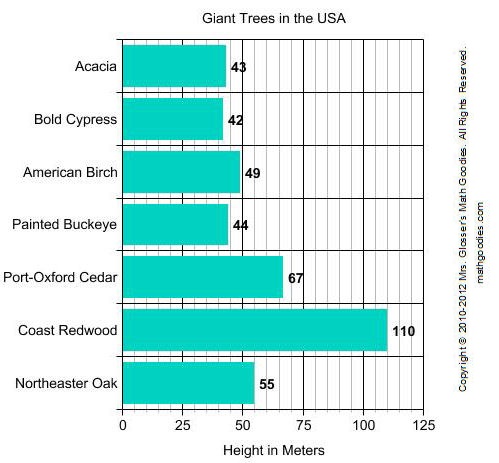
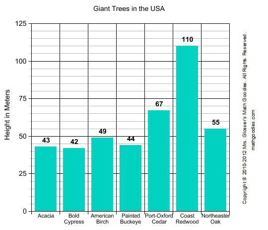
| Exercise 1: | The average heights of various trees in the USA were recorded in meters as shown in the table below. Construct a bar graph to visually display this data. | ||||||||||||||||||
|
|||||||||||||||||||
| Solution: | Answers will vary depending on the scales used and whether the bars are horizontal or vertical. Sample graphs are shown below. | ||||||||||||||||||
 |
|||||||||||||||||||
 |
|||||||||||||||||||
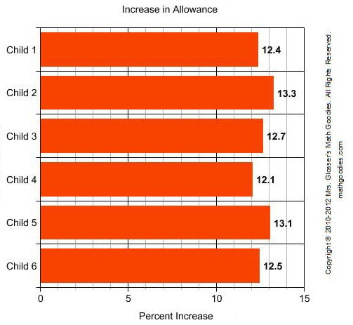
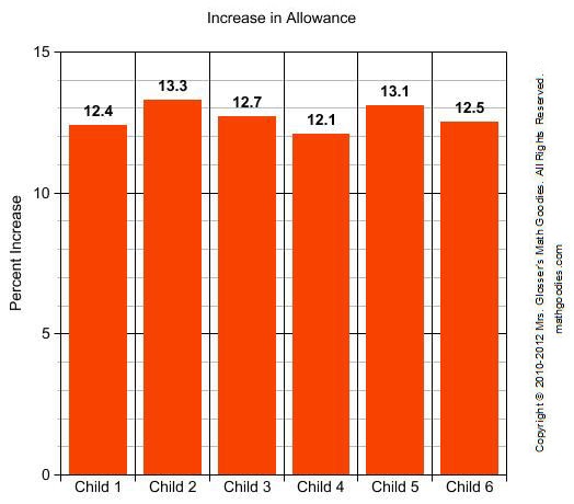
| Exercise 2: | Six children were surveyed to find out what percent increase each received in his/her allowance as shown in the table below. Construct a bar graph to visually display this data. | ||||||||||||||||
|
|||||||||||||||||
| Solution: | Answers will vary depending on the scales used and whether the bars are horizontal or vertical. Sample graphs are shown below. | ||||||||||||||||
 |
|||||||||||||||||
 |
|||||||||||||||||
Data and Circle Graphs
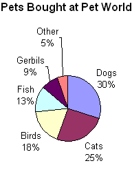
| Exercise | Problem | Answer |
| 1 | How many sectors are in the graph? | 6 |
| 2 | Which type of pet is bought most? | Dogs |
| 3 | Which type of pet is bought least? | Other |
| 4 | What percentage of customers buy gerbils? | 9 |
| 5 | What percentage of customers buy birds? | 18 |
Constructing Circle Graphs
| Exercise 1: | The revenue sources of the federal government were recorded as shown in the table below. Construct a circle graph to visually display this data. | ||||||||||||
|
|||||||||||||
| Solution: | A sample circle graph is shown below. | ||||||||||||
 |
|||||||||||||
| Exercise 2: | The students at a small school were surveyed to determine what method of transportation is used to get to and from school as shown in the table below. Construct a circle graph to visually display this data. | ||||||||||||||
|
|||||||||||||||
| Solution: | A sample circle graph is shown below. | ||||||||||||||
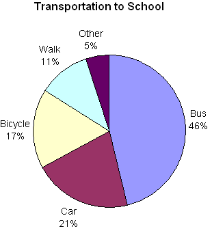 |
|||||||||||||||
Comparing Graphs
| Exercise | Problem | Answer |
| 1 | The ages of 7 trumpet players in a band are 13, 12, 11, 12, 11, 10 and 12. What type of graph would be appropriate for comparing the ages of these trumpet players? | bar |
| 2 | The federal hourly minimum wage was recorded each year from 1990 to 2007. What type of graph would best show the changes in minimum wage during this time period? | line |
| 3 | When asked if "antidisestablishmentarianism" has 28 letters, 50 people said yes, 35 people said no and 15 people said I don't know. What type of graph would best compare these responses to each other and with the total? | circle |
| 4 | The growth of 7 different plants was recorded in centimeters. What type of graph would be best for comparing the growth of each plant? | bar |
| 5 | In a city, the rainfall was recorded in inches each month for 12 months. What type of graph would best display the change in rainfall? | line |
Practice Exercises
Refer to the line graph below for Exercises 1 to 3.
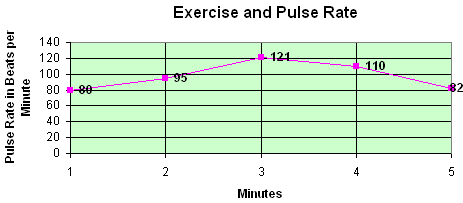
| Exercise | Problem | Answer |
| 1 | What is the largest number on the vertical scale? | 140 |
| 2 | What pulse rate was recorded at 2 minutes? | 95 |
| 3 | A pulse rate of 121 beats per minute was recorded at how many minutes? | 3 |
Refer to the bar graph below for Exercises 4 to 6.
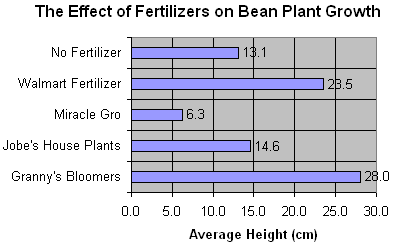
| Exercise | Problem | Answer |
| 4 | How many items are being compared in the graph? | 5 |
| 5 | What was the average height in cm for Granny's Bloomers? | 28.0 or 28 |
| 6 | What was the average height in cm for No Fertilizer? | 13.1 |
Refer to the circle graph below for Exercises 7 to 10.
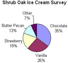
| Exercise | Problem | Answer |
| 7 | How many sectors are in this circle graph? | 5 |
| 8 | What percentage of people in Shrub Oak preferred chocolate ice cream? | 35% |
| 9 | What percentage of people in Shrub Oak preferred butter pecan ice cream? | 13% |
| 10 | If a total of 50 people were surveyed, then how many people preferred vanilla ice cream? | .26 x 50 people = 13 people |
Challenge Exercises
| 1. | Mrs. Glosser's class voted on their favorite type of toy. Each student voted once. Here is the vote: doll 4, action figure 4, educational toy 3, video game 6, electronics 5, building blocks 1. Which of the following bar graphs shows all of these facts correctly? (Note that the title of each graph has been omitted.) |
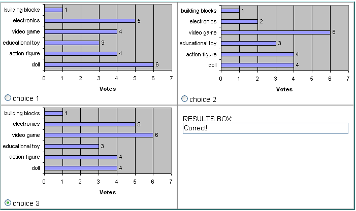
Choice 1 is incorrect because it shows 6 for doll, not 4; and because it shows 4 for video game, not 6.
Choice 2 is incorrect because it shows 2 for electronics, not 5.
Choice 3 is correct because it shows all the facts correctly.
| 2. | An infant's weight was recorded in pounds for each of 7 weeks. Here is the data: Week 1: 7.5 lbs; Week 2: 7.1 lbs; Week 3: 7.4 lbs; Week 4: 7.7 lbs; Week 5: 8.2 lbs; Week 6: 8.6 lbs; Week 7: 9.0 lbs. Which of the following line graphs shows all of these facts correctly? (Note that the title of each graph has been omitted. Also, the value for each point has not been labeled.) |
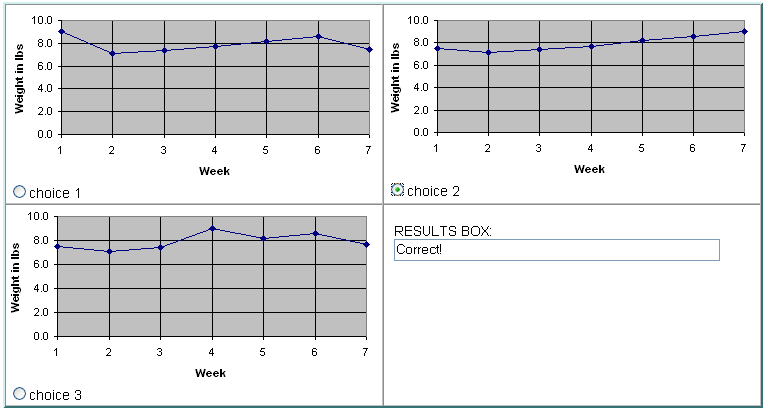
Choice 1 is incorrect because the value it shows for Week 1 is about 9 lbs, not 7.5 lbs.
Choice 3 is incorrect because the value it shows for Week 4 is about 9 lbs, not 7.7 lbs.
Choice 2 is correct because it shows all the facts correctly.
| 3. | The amount of time spent on daily activities is given in hours as follows: School 8, Sleep 6, Entertainment 5, Homework 3, Meals 2. Which of the following circle graphs shows all of these facts correctly? (Note that all titles have been omitted.) |
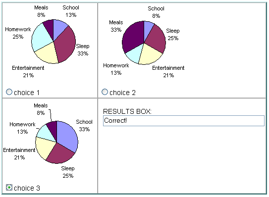
Choice 1 is incorrect because: [1] The percentages for each sector do not match the given data. [2] The sectors are not drawn from largest to smallest in a clockwise direction.
Choice 2 is incorrect because: [1] The percentages for each sector do not match the given data. [2] The sectors are not drawn from largest to smallest in a clockwise direction.
Choice 3 is correct because it shows all the facts correctly.
| Exercise | Problem | Answer |
| 4 | What kind of graph would you use to represent the speed in km per hour of the world's fastest 20 animals? | bar |
| 5 | What kind of graph would you use to represent the annual number of vehicle fatalities in your state for the last 10 years? | line |
| 6 | What kind of graph would you use to represent the number of Internet users in 10 different countries? | bar |
| 7 | What kind of graph would you use to represent the percentage of students in your school by grade level? | circle |
Refer to the line graph below to answer Exercise 8.
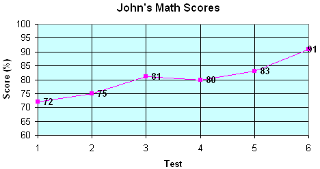

The scale starts at 60 instead of at 0.
Refer to the bar graph below to answer Exercise 9.
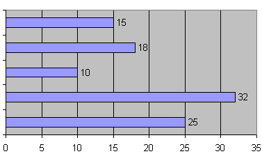

There are no labels along the vertical scale.
Refer to the circle graph below to answer Exercise 10.
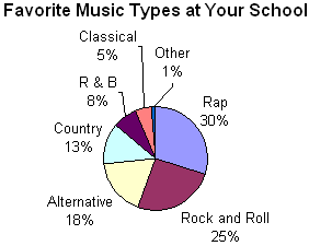

This circle graph has 7 sectors. It is cluttered and difficult to read. There is too much data presented in this graph.

