Learn About Bar Graphs With The Following Examples And Interactive Exercises
Use the following examples and interactive exercises to learn about bar graphs.
Example 1: A survey of students' favorite after-school activities was conducted at a school. The table below shows the results of this survey.
| Students' Favorite After-School Activities | |
| Activity | Number of Students |
| Play Sports | 45 |
| Talk on Phone | 53 |
| Visit With Friends | 99 |
| Earn Money | 44 |
| Chat Online | 66 |
| School Clubs | 22 |
| Watch TV | 37 |
Note that since the data in this table is not changing over time, a line graph would not be a good way to visually display this data. Each quantity listed in the table corresponds to a particular category. Accordingly, the data from the table above has been displayed in the bar graph below.
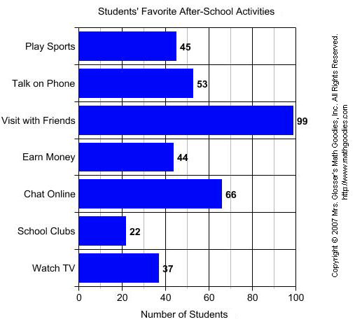
A bar graph is useful for comparing facts. The bars provide a visual display for comparing quantities in different categories. Bar graphs help us to see relationships quickly. Another name for a bar graph is a bar chart. Each part of a bar graph has a purpose.
| title | The title tells us what the graph is about. |
| labels | The labels tell us what kinds of facts are listed. |
| bars | The bars show the facts. |
| grid lines | Grid lines are used to create the scale. |
| categories | Each bar shows a quantity for a particular category. |
Now that we have identified the parts of a bar graph, we can answer some questions about the graph in Example 1.

| QUESTION | ANSWER | ||
| 1. | What is the title of this bar graph? | Students' Favorite After-School Activities | |
| 2. | What is the range of values on the (horizontal) scale? | 0 to 100 | |
| 3. | How many categories are in the graph? | 7 | |
| 4. | Which after-school activity do students like most? | Visit With Friends | |
| 5. | Which after-school activity do students like least? | School Clubs | |
| 6. | How many students like to talk on the phone? | 53 | |
| 7. | How many students like to earn money? | 44 | |
| 8. | Which two activities are liked almost equally? | Play Sports and Earn Money | |
| 9. | List the categories in the graph from greatest to least. | Visit With Friends, Online, Talk on Phone, Play Sports, Earn Money, Watch TV, School Clubs. | |
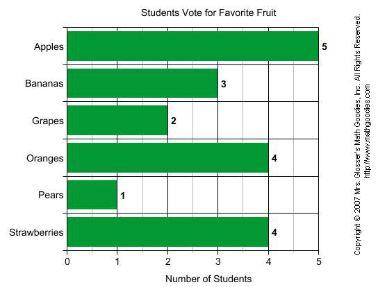
Example 2: Students in a class voted on their favorite fruit. Each student voted once. The bar graph below summarizes the data collected from the class vote.
| QUESTION | ANSWER | ||
| 1. | What is the range of values on the (horizontal) scale? | 0 to 5 | |
| 2. | How many categories are in the graph? | 6 | |
| 3. | Which fruit had the most votes? | Apples | |
| 4. | Which fruit had the least votes? | Pears | |
| 5. | How many students voted for bananas? | 3 | |
| 6. | How many students voted for grapes? | 2 | |
| 7. | Which two fruits had the same number of votes? | Oranges and Strawberries | |
| 8. | List the categories in the graph from least to greatest. | Pears, Grapes, Bananas, Oranges, Strawberries, Apples. | |
The bar graphs in Examples 1 and 2 each have horizontal bars. It is also possible to make a bar graph with vertical bars. You can see how this is done in Example 3 below.
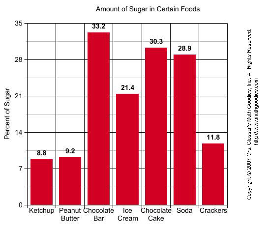
Example 3: The amount of sugar in 7 different foods was measured as a percent The data is summarized in the bar graph below.
| QUESTION | ANSWER | ||
| 1. | What is the title of this bar graph? | Amount of Sugar in Certain Foods | |
| 2. | What is the range of values on the (vertical) scale? | 0 to 35 | |
| 3. | How many categories are in the graph? | 7 | |
| 4. | Which food had the highest percentage of sugar? | Chocolate Bar | |
| 5. | Which food had the lowest percentage of sugar? | Ketchup | |
| 6. | What percentage of sugar is in soda? | 28.9% | |
| 7. | What is the difference in percentage of sugar between ice cream and crackers? | 21.4 - 11.8 = 9.6% | |
Summary: A bar graph is useful for comparing facts. The bars provide a visual display for comparing quantities in different categories. Bar graphs help us to see relationships quickly. Bar graphs can have horizontal or vertical bars. Another name for a bar graph is a bar chart.
Exercises
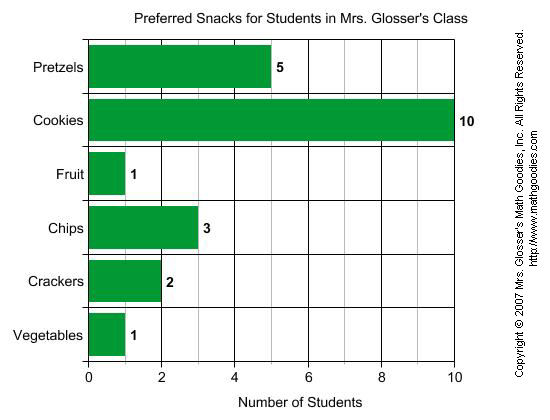
Directions: Refer to the bar graph below to answer each question. For each exercise below, click once in the ANSWER BOX, type in your answer and then click ENTER. Your answer should be given as a word or as a whole number. After you click ENTER, a message will appear in the RESULTS BOX to indicate whether your answer is correct or incorrect. To start over, click CLEAR.
Students in Mrs. Glosser's class were surveyed about snacks and asked to choose the one snack food they liked most from a list. The bar graph below summarizes the data collected from this survey.
| 1. |
Which snack was preferred most? |
| 2. |
Which snack was preferred by 2 students? |
| 3. |
How many students preferred pretzels? |
| 4. |
Which snack was preferred by 3 students? |
| 5. |
According to the graph, what value corresponds to the number of students who preferred fruit and vegetables equally? |


